Barbara
(usluge)
Brend identity
Social
(SURADNICI)
Foto:
Daria Opačak Škaro
(godina)
2024

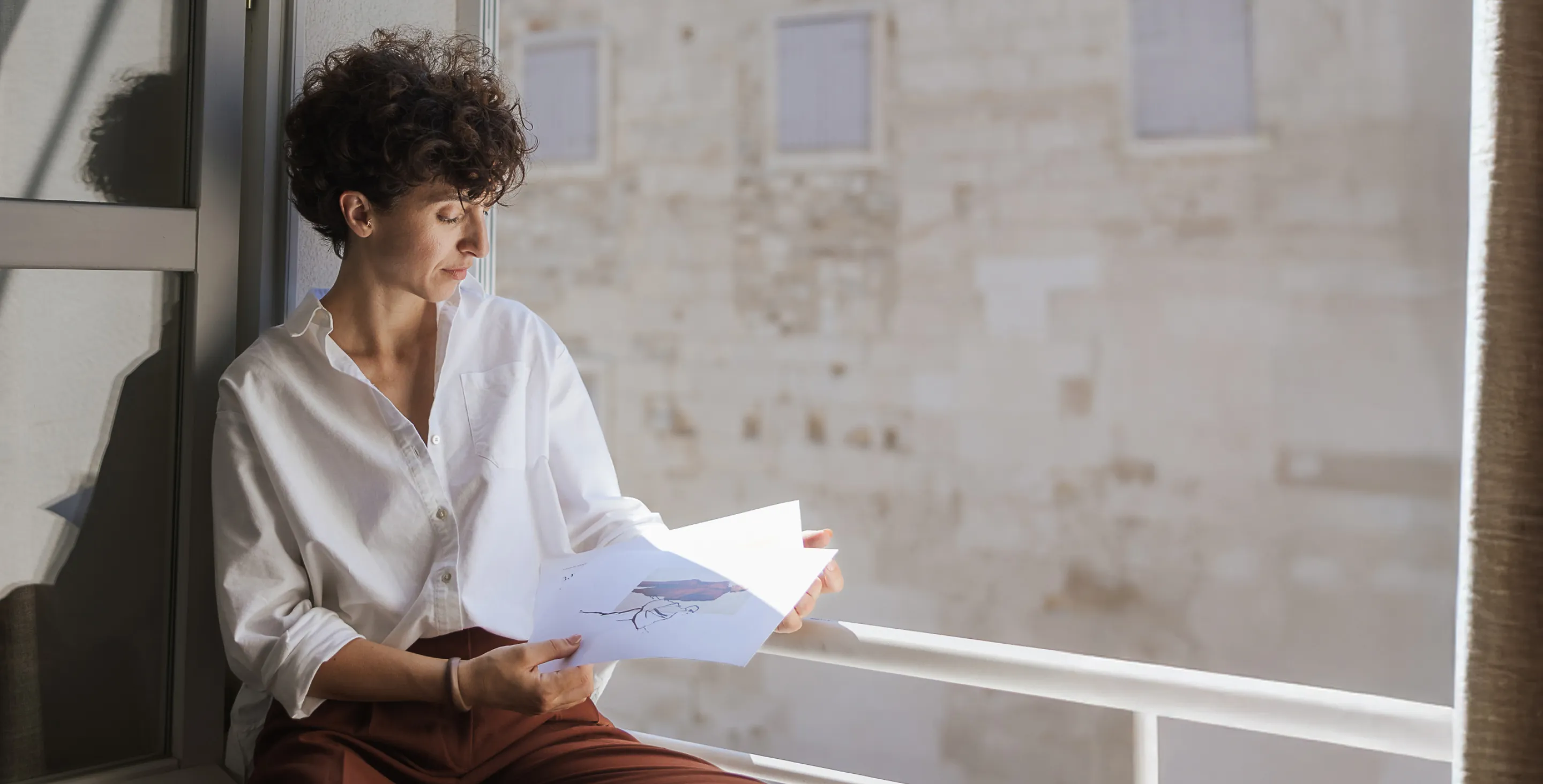
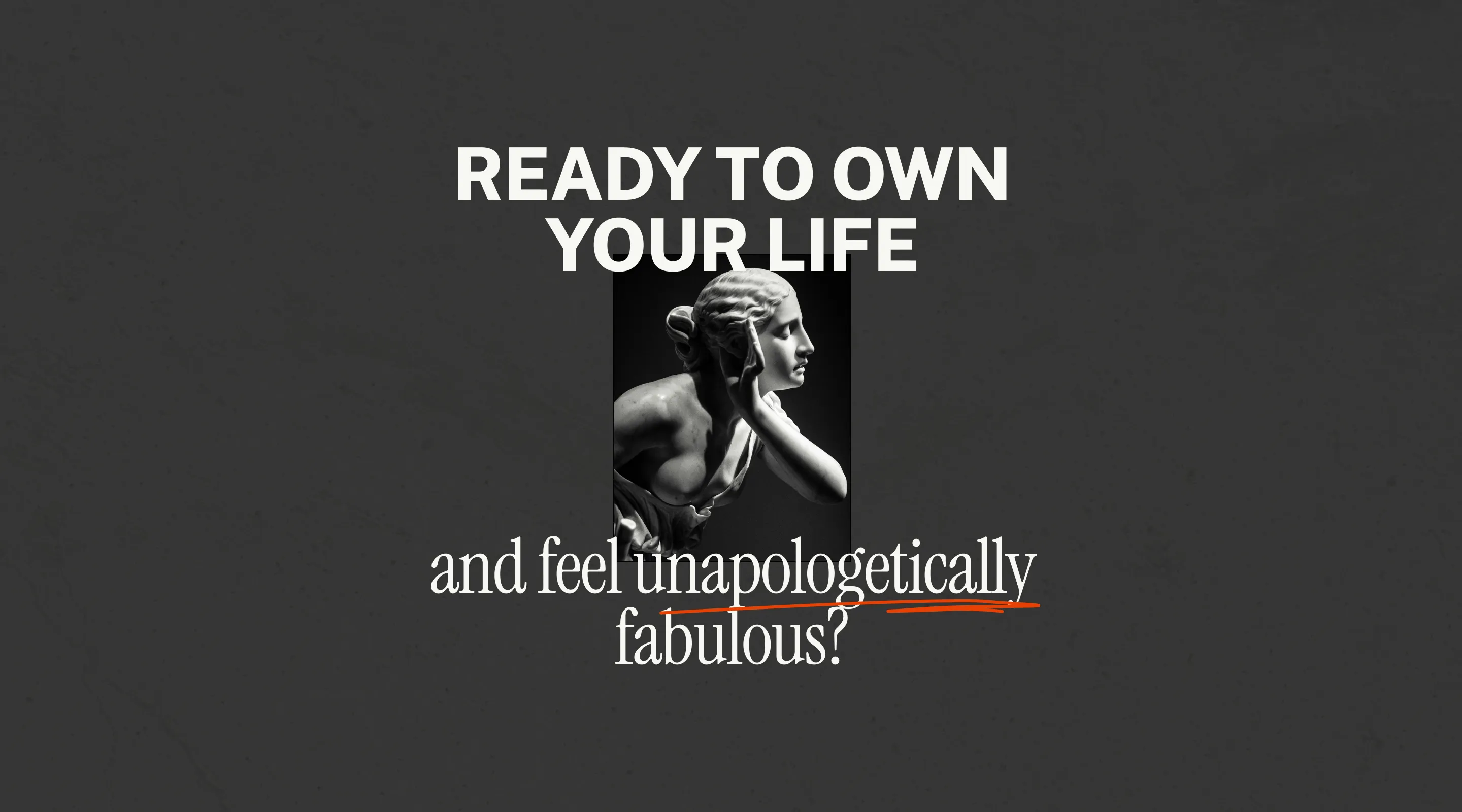
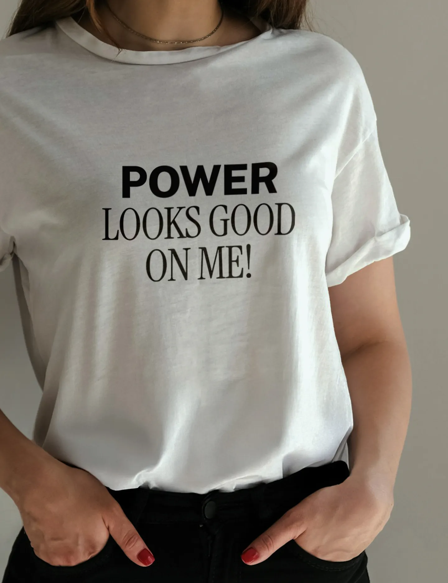
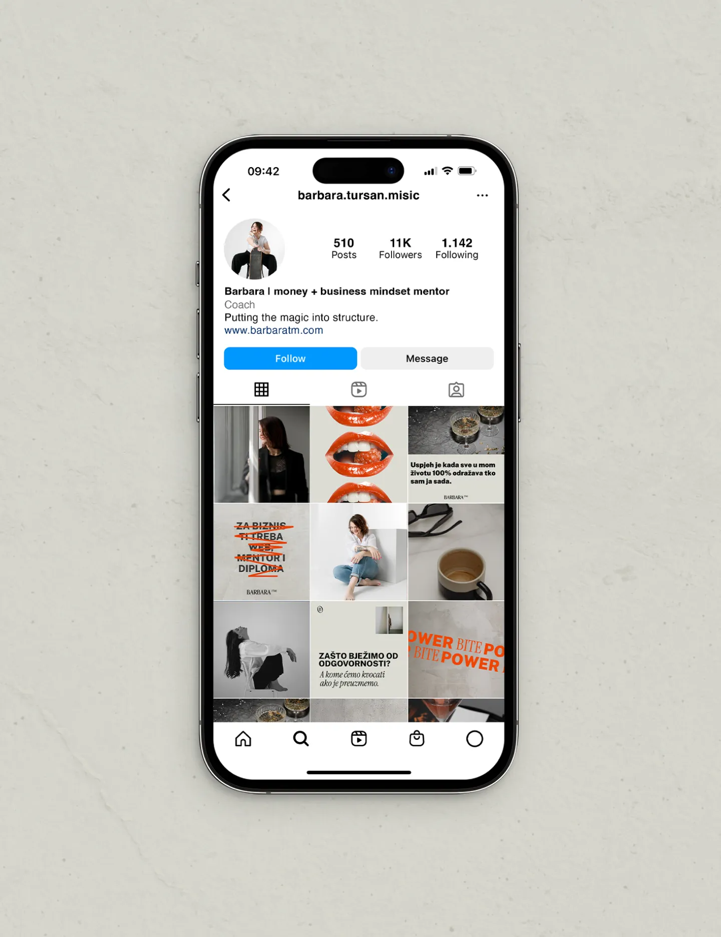
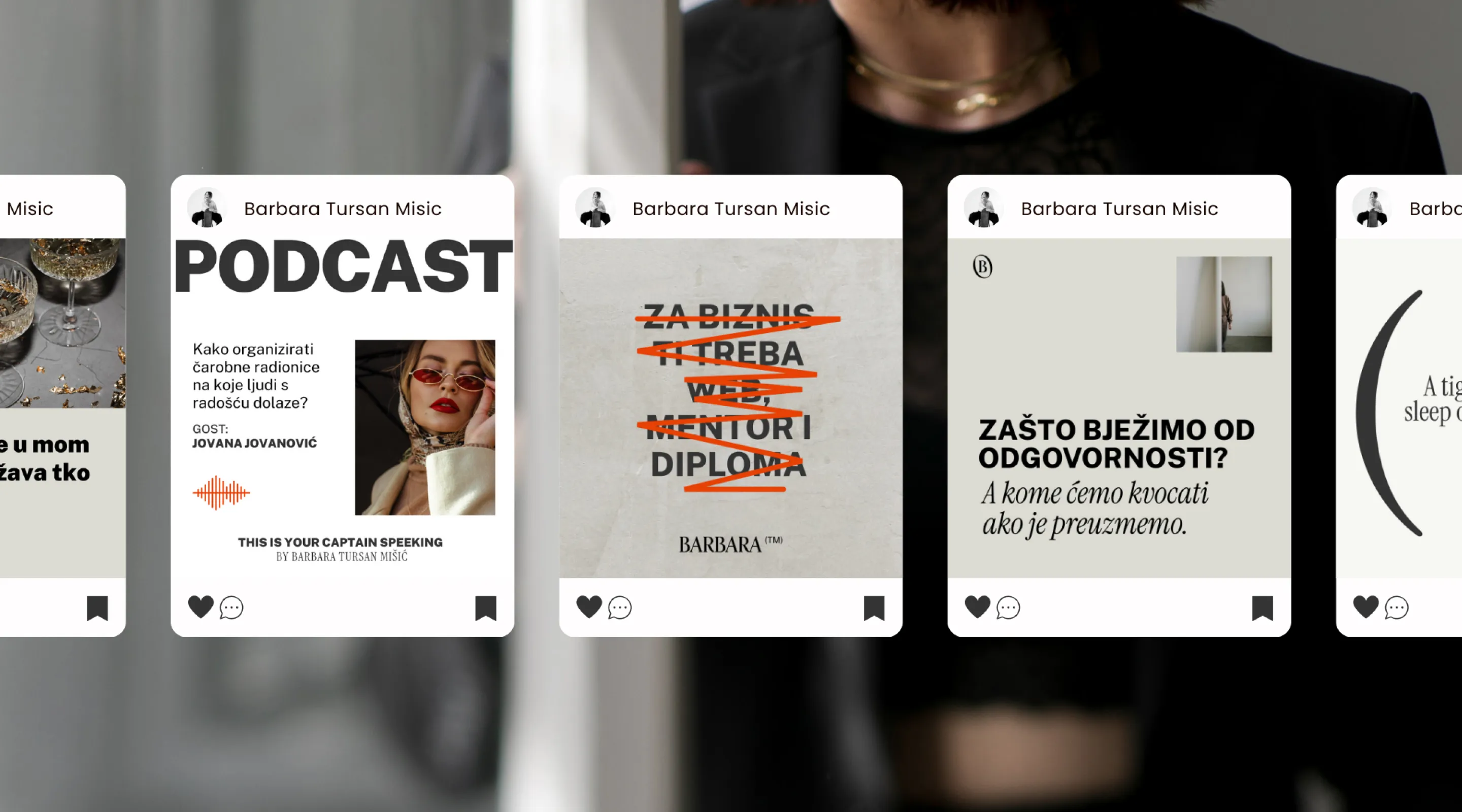
Barbara came to me when she felt she had outgrown her previous visual identity. She wanted her message, “Do the work and feel the power,” to truly reach and inspire her clients, which meant the visual identity needed to evolve with it.
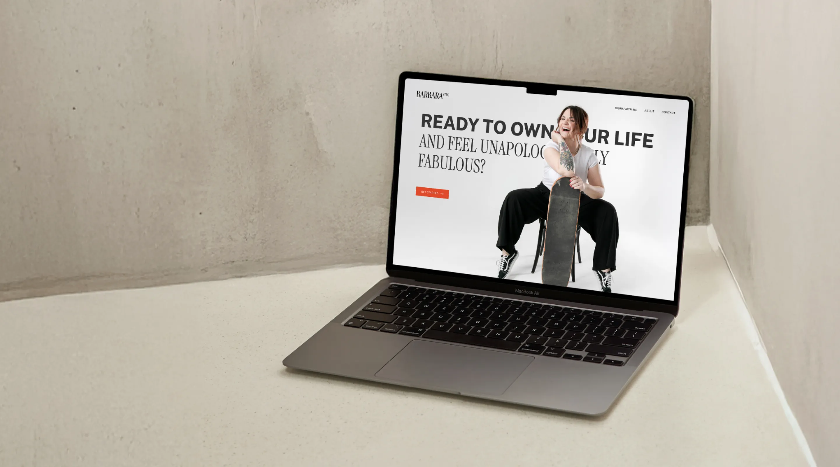
We created a new visual identity and Instagram templates to support her strategy and communication.
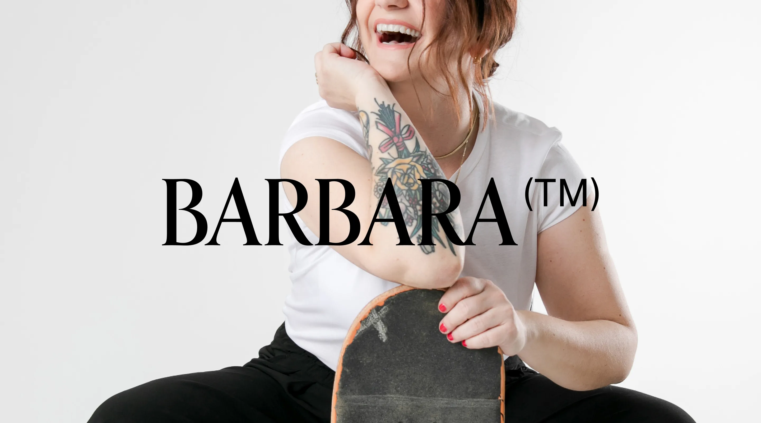
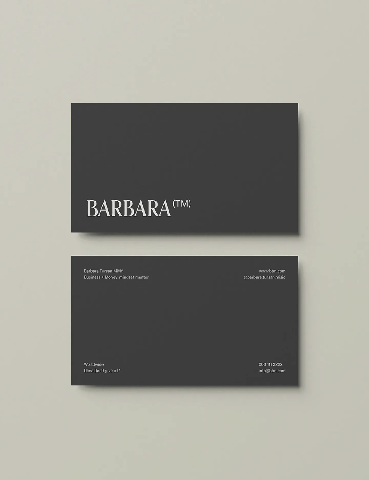
The logo uses Orpheus Pro to create a strong, typographic mark centered on the name, with superscript initials forming a subtle (TM), a nod to originality.
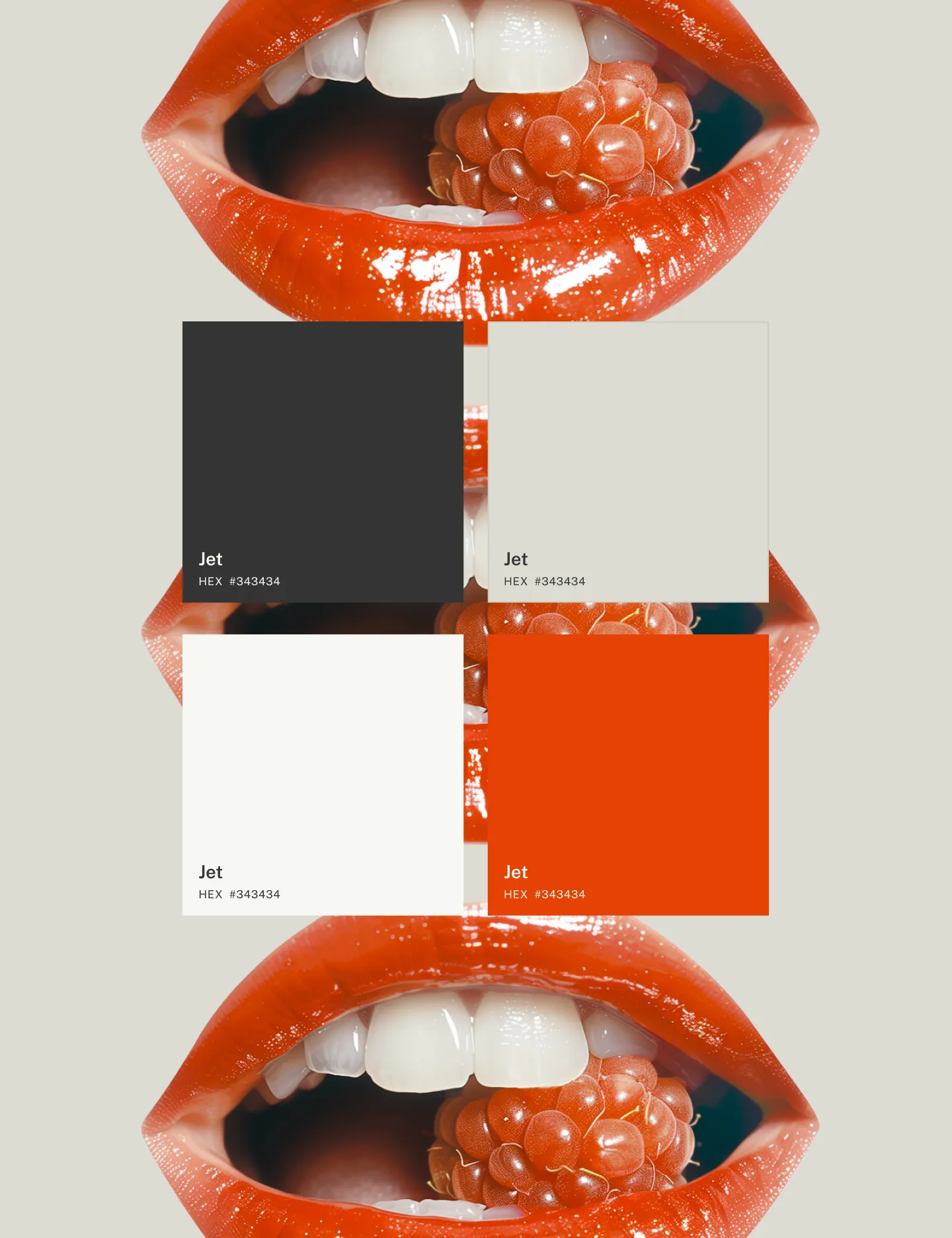
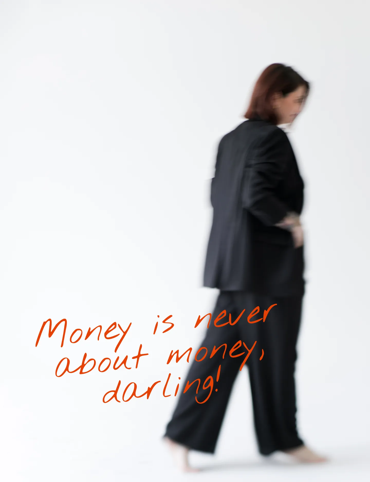
The palette features Flame of Prometheus for energy and strength, balanced with dark grey and soft beige.
The typography pairs modern Public Sans with the elegance of Instrument Serif, while Nothing You Could Do adds a playful, bold accent.

Riječi nakon suradnje
( koje su mi ispunile <3 )
“The experience was both challenging and beautiful. I felt supported and guided throughout, pushed to grow into a higher version of myself, yet fully supported. I trusted you deeply, which meant letting go of control — something that doesn’t come easily to me. ”
Barbara Tursan Mišić
money & business mindset mentor