Reci mi
(usluge)
name
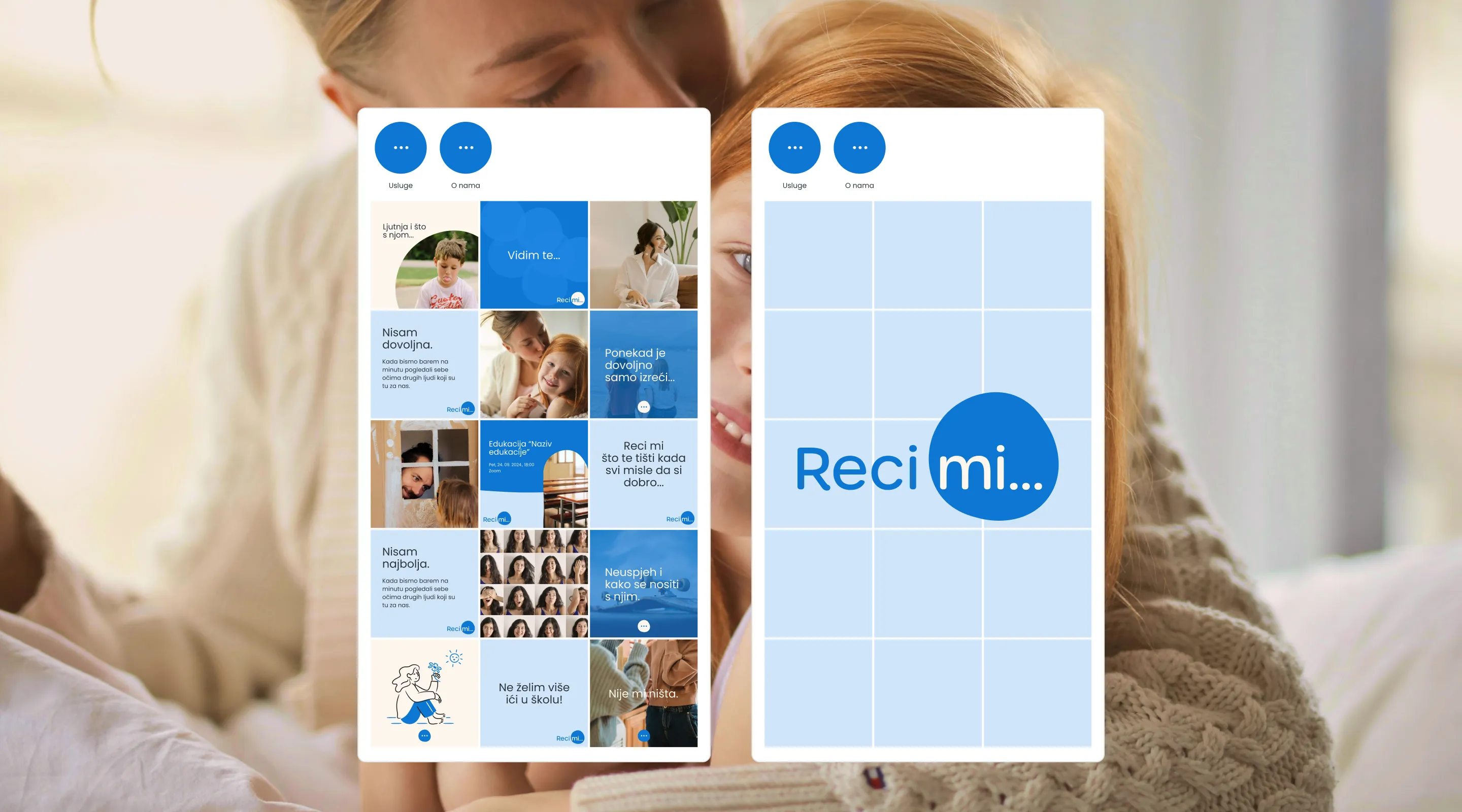
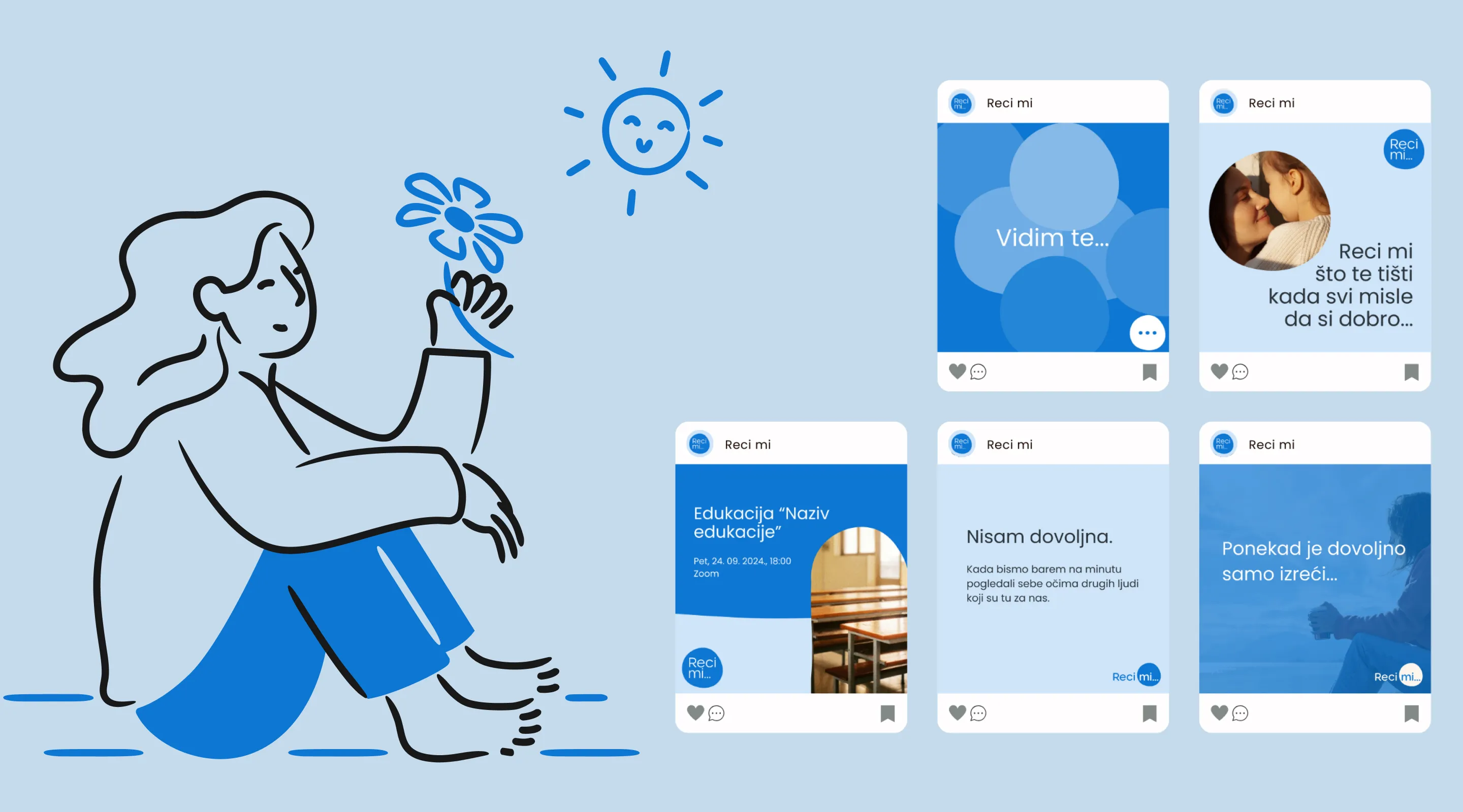
Brend identity
Social
(SURADNICI)
(godina)
2024
Iva, the founder, came to me with the goal of creating a recognizable identity that would resonate with children, adolescents, and parents alike.
Together, we defined honest, open communication as the core of the brand, the foundation of every process and relationship.
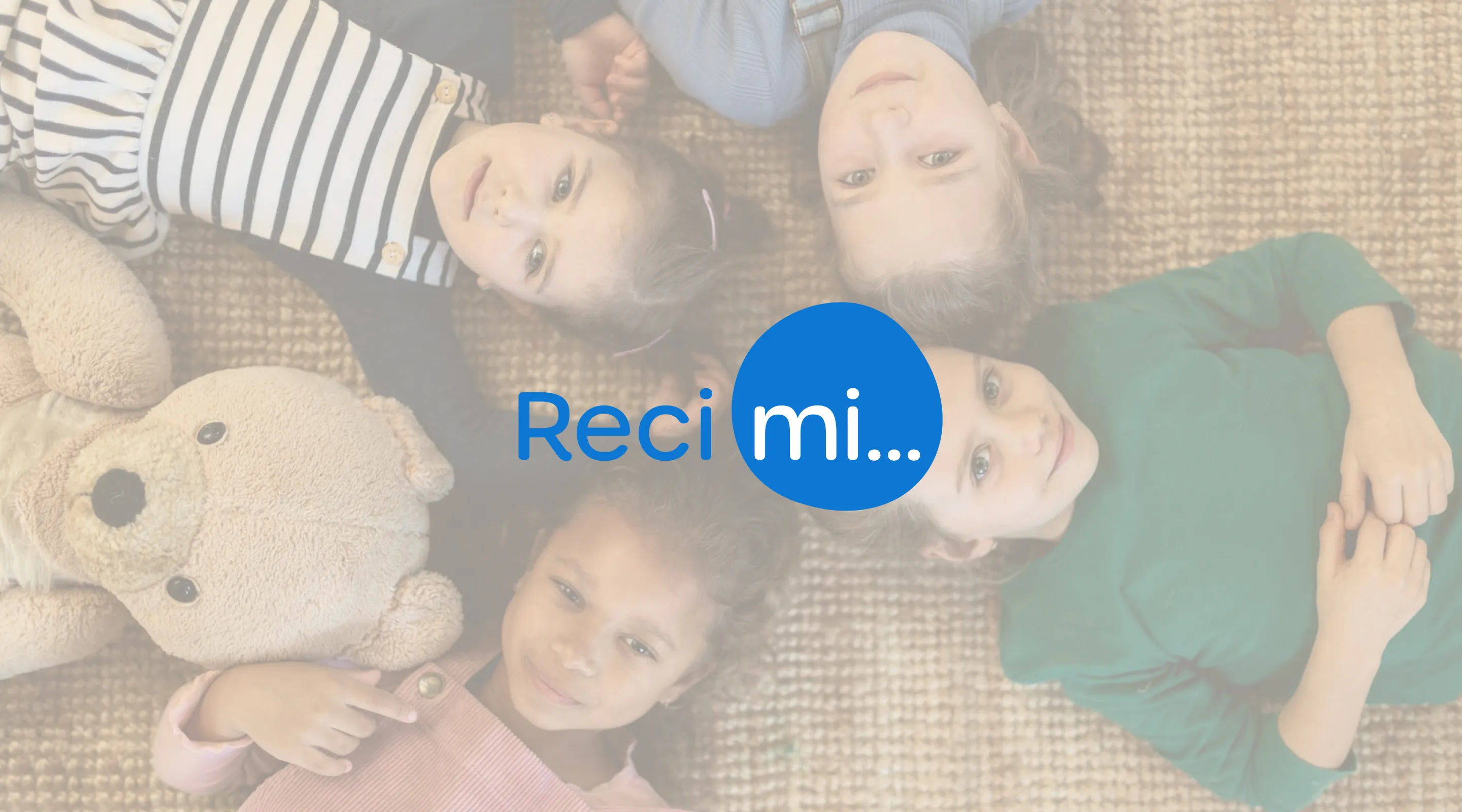
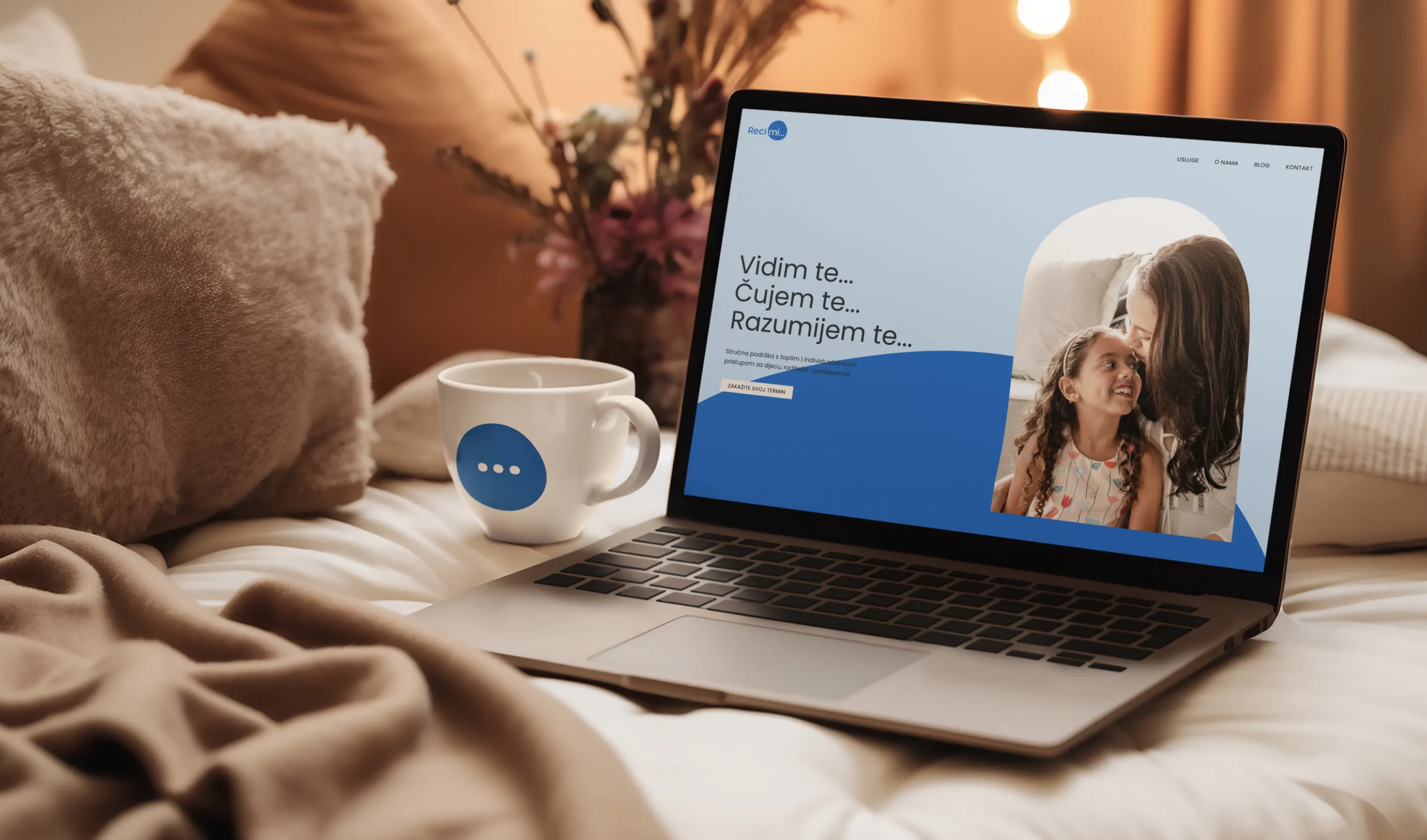
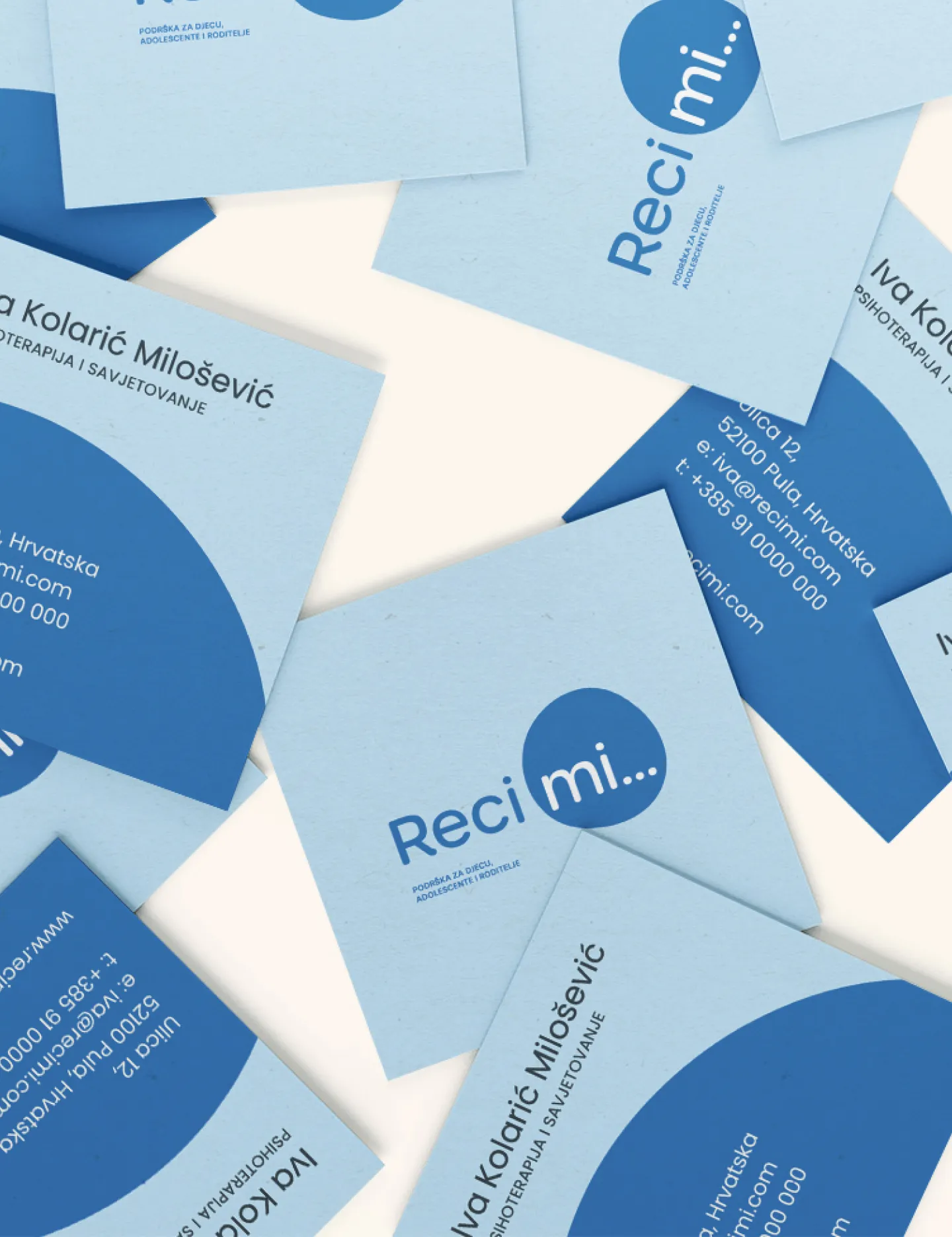
From that idea came the name “Reci mi” (which means “Tell me” in Croatian) — an invitation to speak, creating a personal and trusting tone. To clarify the focus, we added the line: “Support for children, adolescents, and parents.”
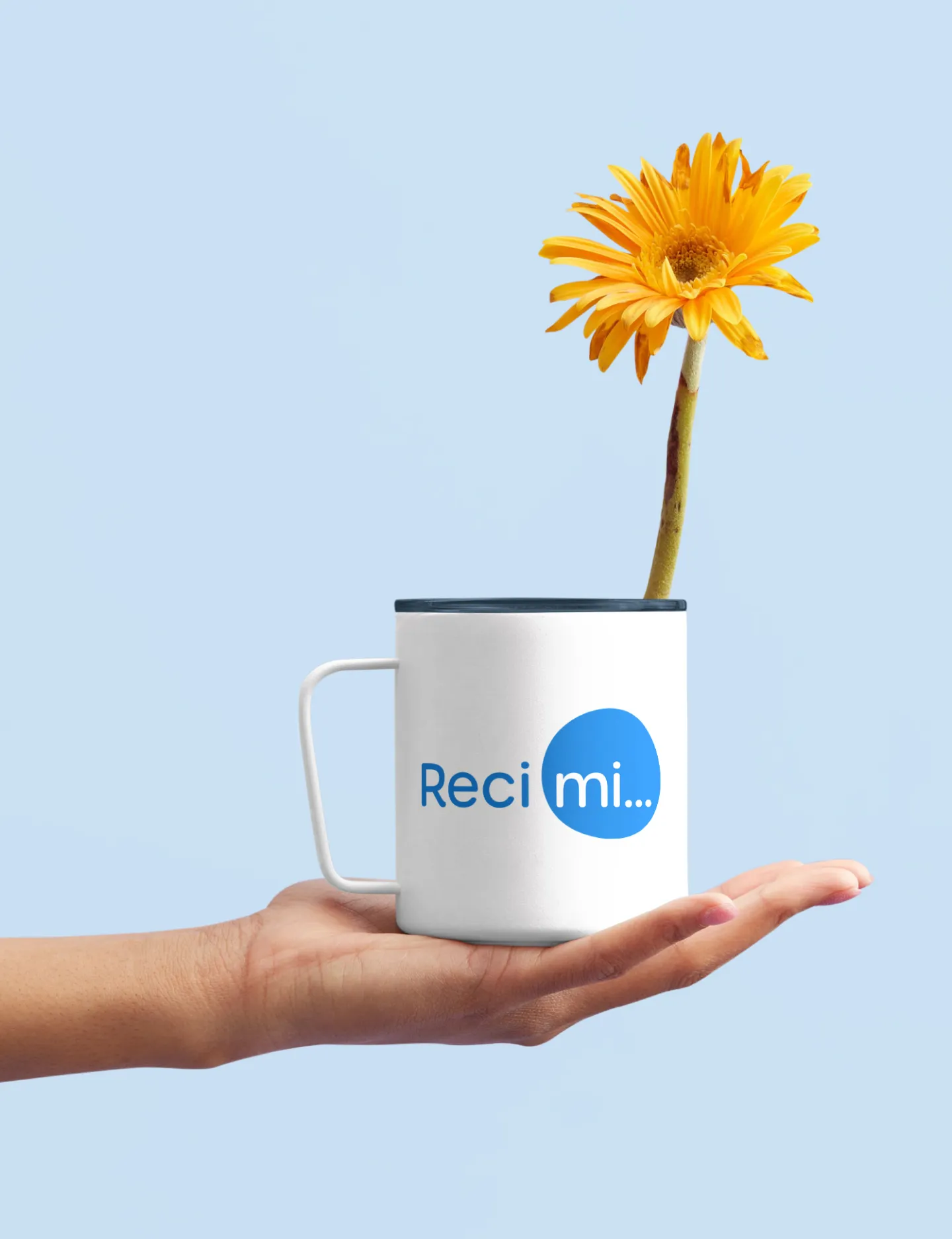
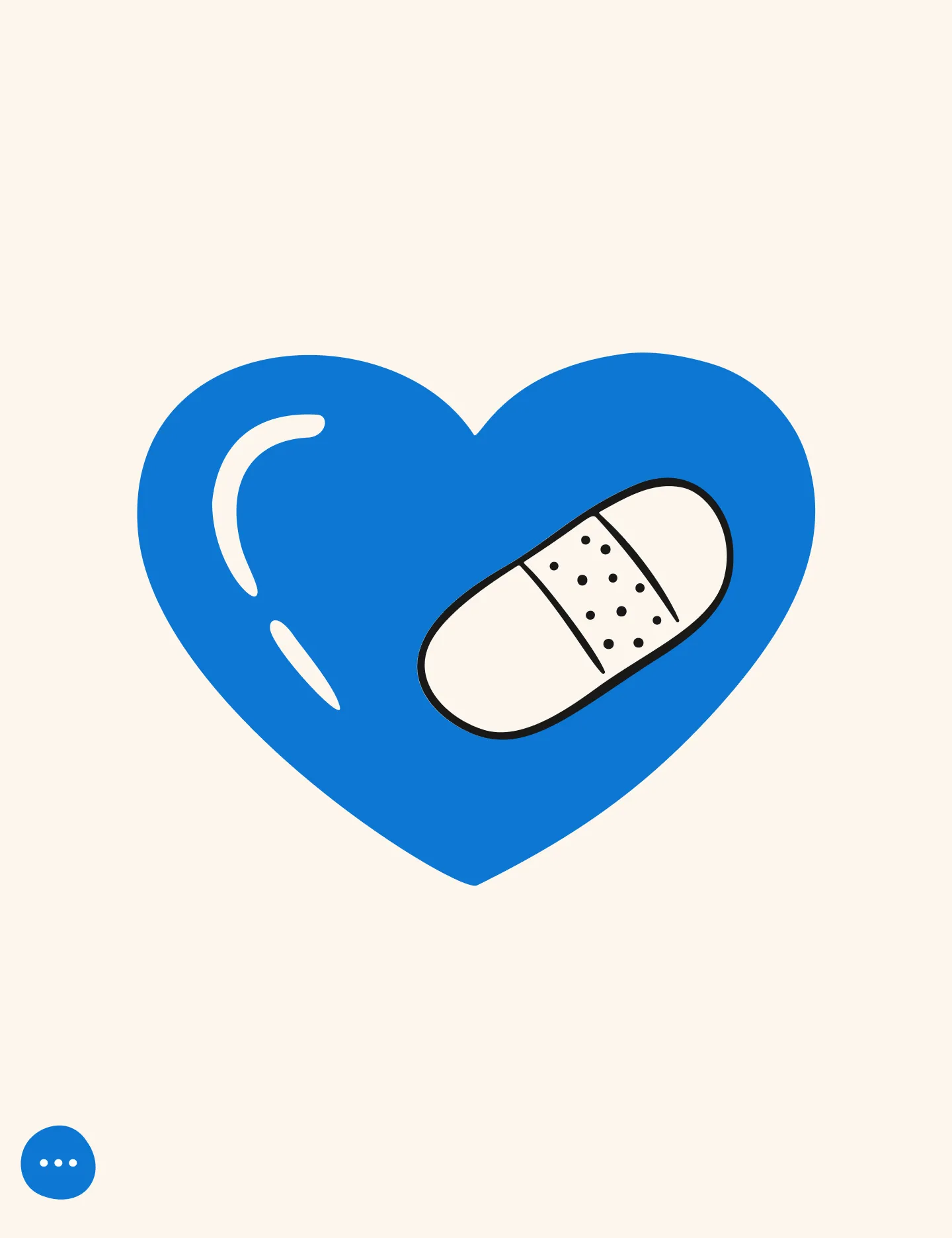
The idea of honest communication and a safe, trusting space is reflected in the logo. The imperfect circle symbolizes a secure space and the process of discovery, while the “mi” at its center highlights the relationship between therapist and client.
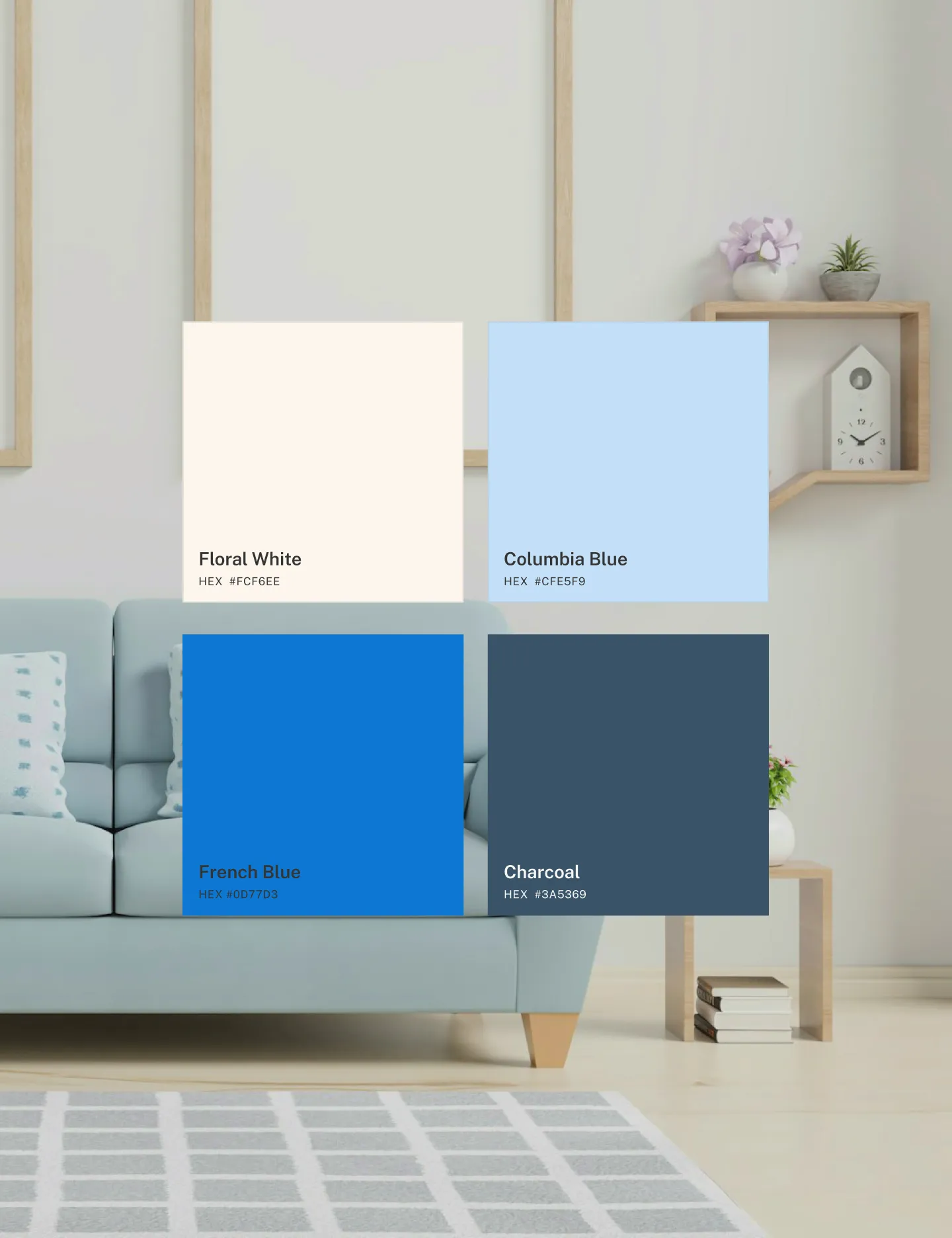
The color palette reinforces a sense of trust, stability, and clarity.
We chose a modern, geometric typeface, Poppins, warm and approachable, yet clear and professional.

Riječi nakon suradnje
( koje su mi ispunile <3 )
“I would choose you again without hesitation. You really took the time to understand my needs and desires, listened to my thoughts, doubts, and fears, and trusted the process, even when I felt completely inexperienced.”
Iva Kolarić Milošević
Founder of Reci mi, a psychology center for children, adolescents, and parents